
/ Safe, Invest & Pay in one app.
Safe, Invest & Pay in one app.
Client
Bando
Service
Product design
Year
2026
Industry
Fintech
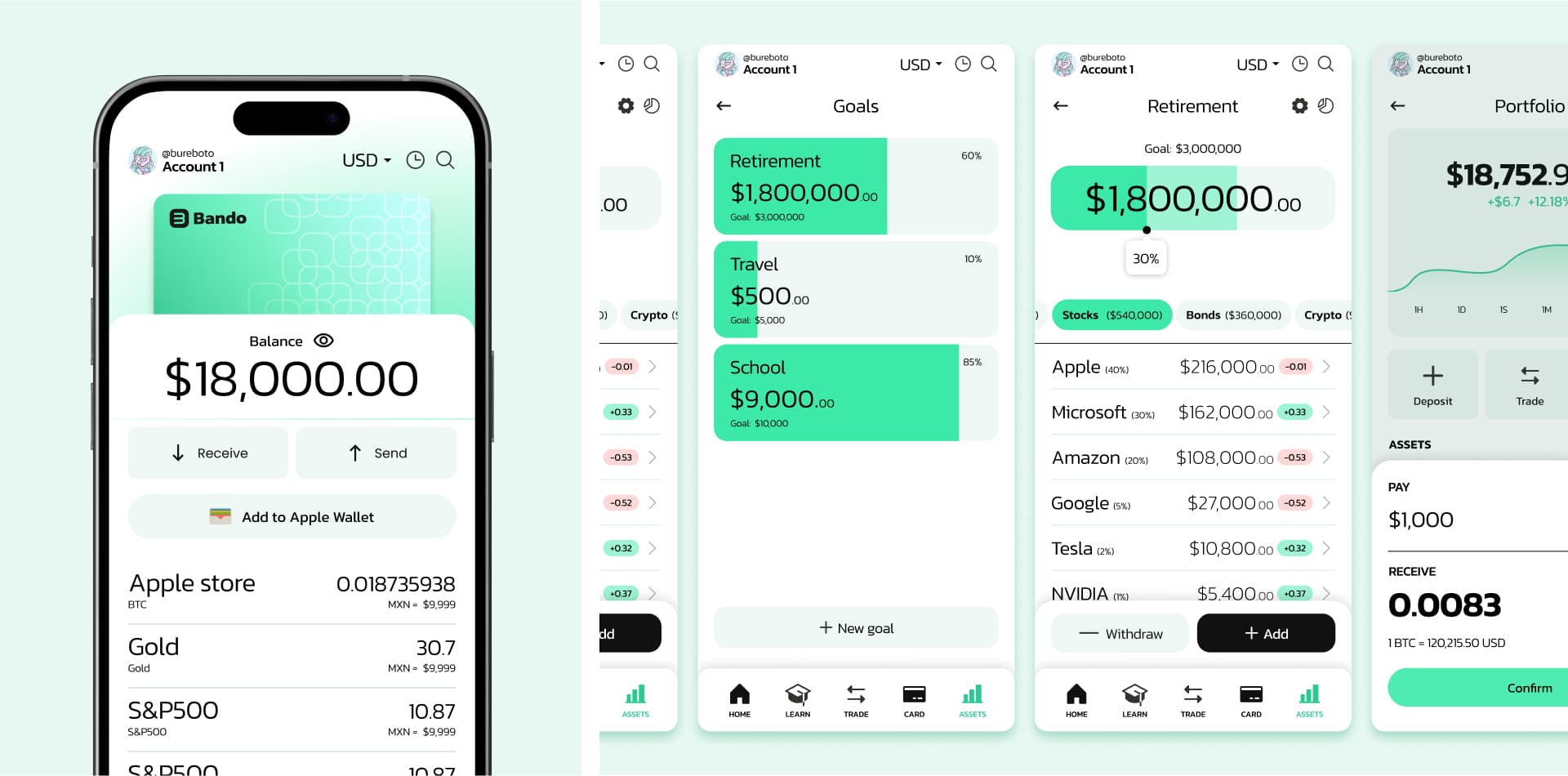
Bando was a fintech. Users could invest in tokenized CETES, stocks like Tesla, gold, or crypto like Bitcoin.
Users could also create their own savings goals and pay for everyday purchases.
Main objetive
It should feel like a traditional bank, but everything ran on blockchain.
The product was announced publicly, but it never launched.
My rol
Principal designer.
Special thanks to Ab, Eduardo Ríos, and Guayabas for trusting me and letting me be part of this amazing project.
Context
Bando had two types of users
People (B2C)
First, people who wanted to invest, with little or medium experience.
Companies (B2B)
Second, other fintechs. Bando wanted established companies to connect our product to their apps.
Business goal
Bando earned a fee on every transaction, so the business needed volume.
That gave me three design goals: Conversion, so people actually invest; Trust, so blockchain feels safe; and Scalability, so the design works for other companies too.
Challenge
How do we make something complex feel simple and trustworthy?
For most people, blockchain is new and confusing.
So this was the question behind every decision I made.
Research
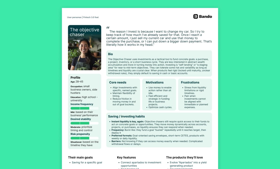
We created the user personas, and I gave feedback on it. Then I joined the user interviews and tests.
I tested the flows, made changes, and tested again.
→ Persona
→ Test
→ Iterate
That was thanks to Julián, who did the research to give us a guide about our main user personas.
Explorations
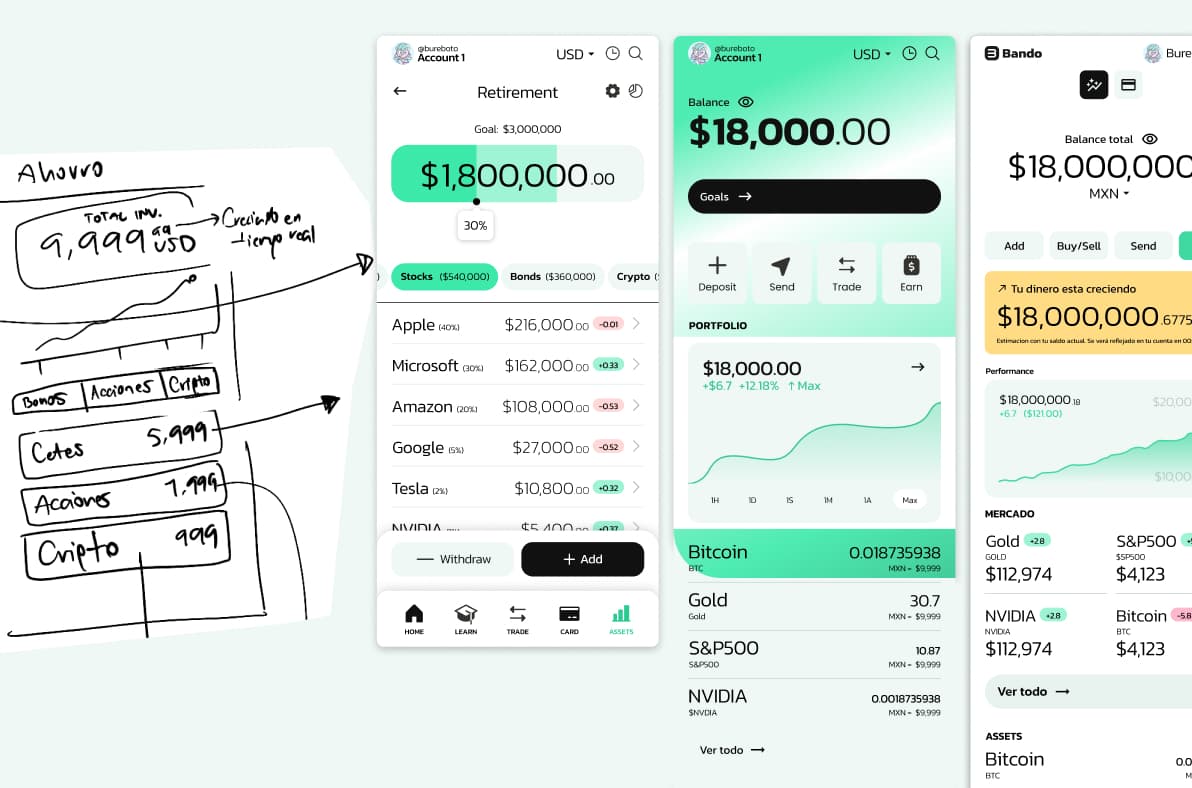
From the sketches to screens
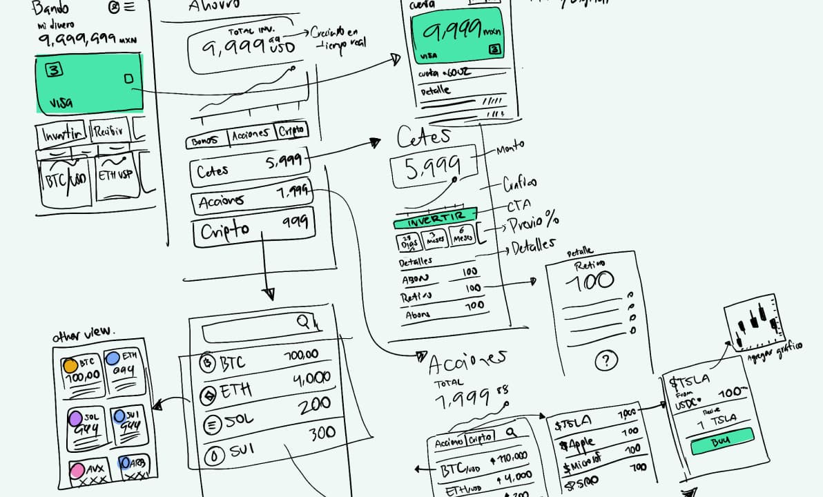
This is how the visual started: on paper.
The UI showed users their investments, returns, goal progress, and transactions, all in one place.
Design Goals
1.
Convertion
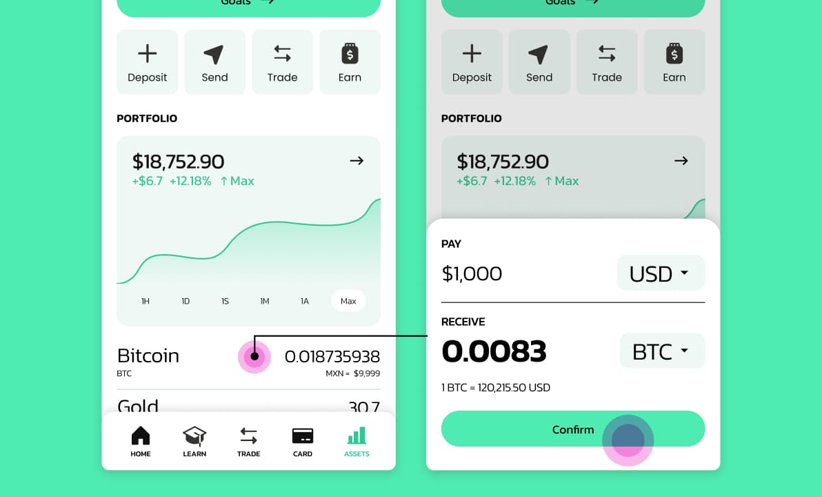
Transactions in a couple taps.
From the home screen, users can make a transaction directly, without going to another screen.
We placed the most popular investments right there. We also set a default amount, which users can change.
2.
Trust & Simplicity
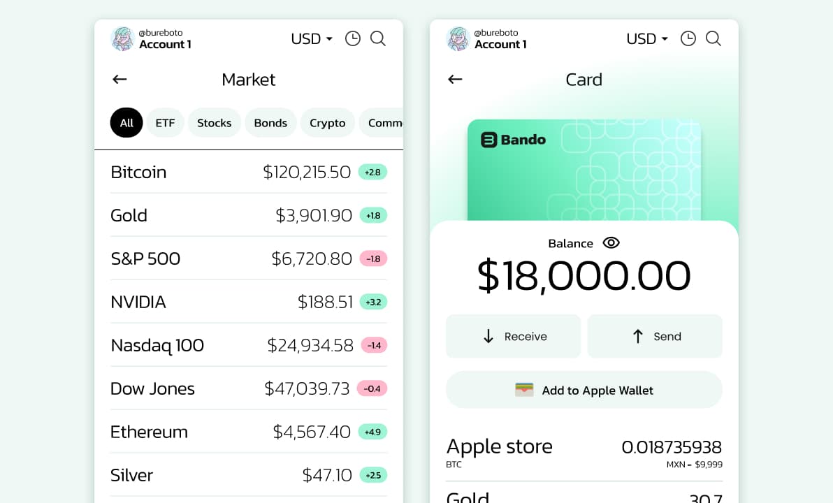
Focus on the content.
We kept a clear hierarchy of elements and data, with nothing extra. Accent colors appear only when the screen needs them, like CTAs and price changes.
The goal: clear, minimal screens.
3.
A scalable design system
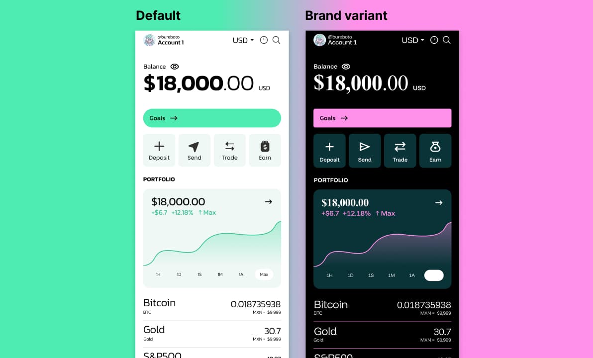
One system, many brands
For the B2B side, I built a themeable design system.
The components and the structure stayed the same, but each company could change colors, typography, borders, and other visual details to match their own brand.
Here you can see the same component with two different brands. We explored this with an established Mexican fintech, and they liked it so much that they asked us to redesign some of their own flows.
It wasn't all sweet
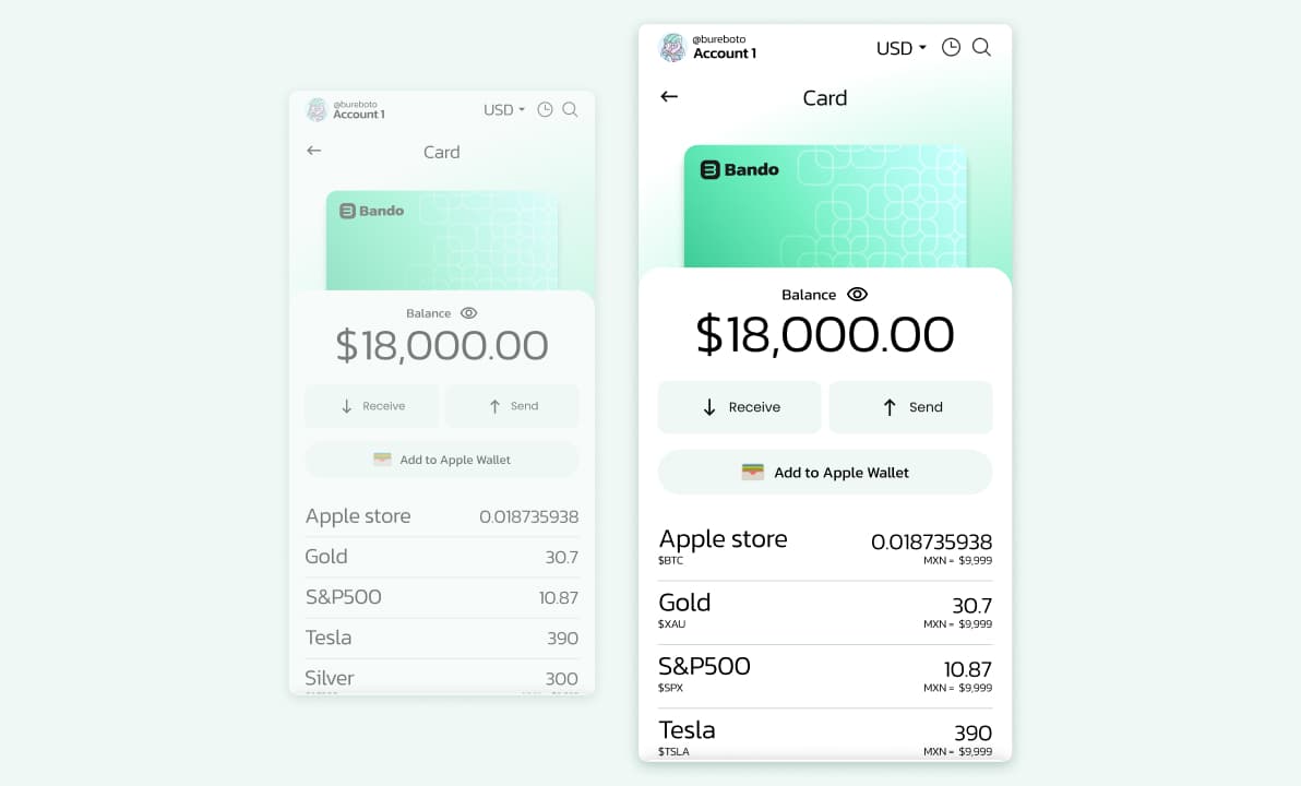
The brand problem
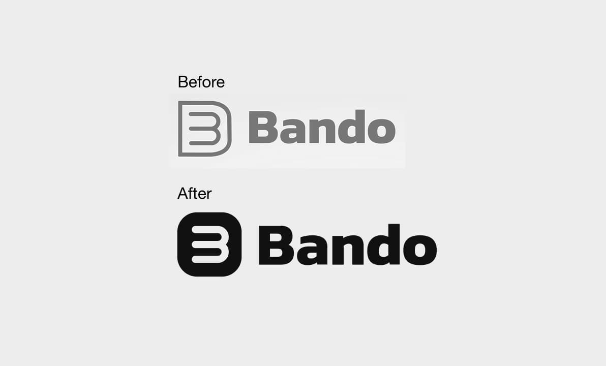
The old logo didn't scale
It wasn't designed to scale. At small sizes, like an app icon, the symbol got lost. Also, our products didn't look connected; they looked like different companies.
So I raised my hand and proposed a rebrand.
Evolution, not revolution
One option was to change the logo completely.
But the founders wanted to keep it, because the symbol had a special meaning for them. So I decided to evolve it instead.
I kept the meaning, but fixed the problems: it works at any size now, and it became the base of a complete visual system.
Legal requirements
To keep the screens simple, I had removed some legal information... But it was required.
Instead of fighting it, I designed a way to show it without breaking the flow, and I made it a component in the design system, so it was consistent everywhere.
Saving goals
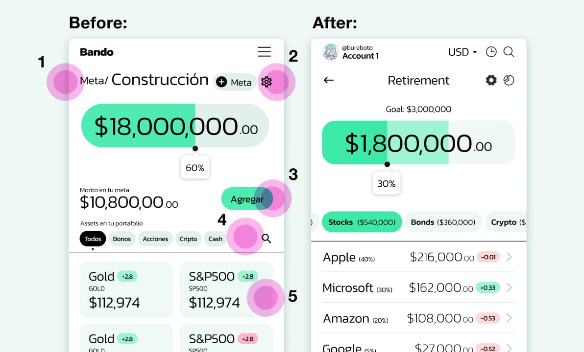
In user tests, we noticed that users didn't understand some tasks, so we made these changes:
1. Screen title
It needed to be clearer.
2. Secondary tasks
"Add goal" didn't belong on this screen.
3. CTA Add
We moved it closer to the thumb.
4. Labels
We made them bigger and added details.
5. Assets
We changed the grid to a list.
Two founders, Two opinions
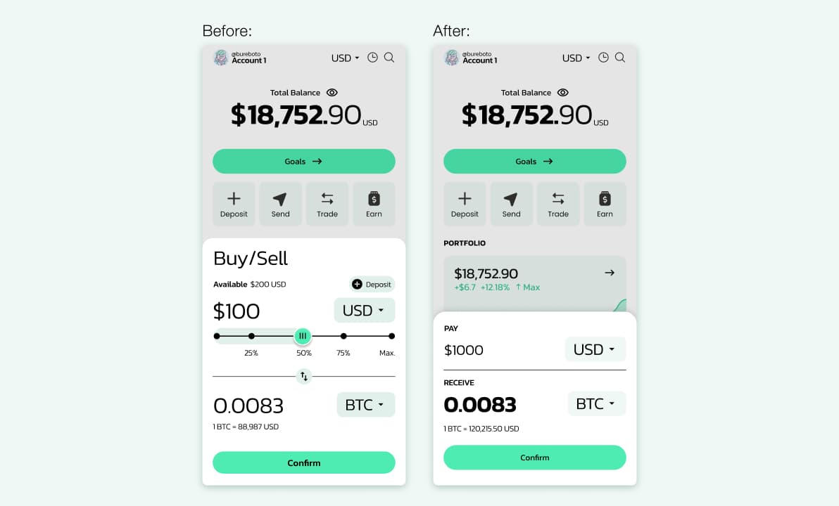
One founder wanted to show a lot of information on the first screen. The other wanted very little. Instead of choosing a side, I went back to our user persona and our goals.
Our users had little experience, so too much information could scare them.
But too little could feel like we were hiding something.
So we found a middle point:
We kept the interaction in a modal, but reduced the information and decisions inside it.
Result
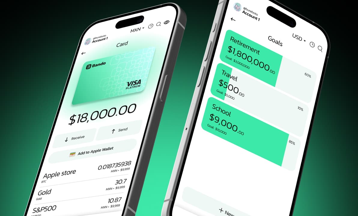
Previews about V1 product.
Content to the public announcement.
Learnings
What we validated
What I learned
1st – Ask about legal and regulatory limits
From day one, even as a designer.
2nd – Push for a smaller MVP
to get real data sooner.
Otros proyectos
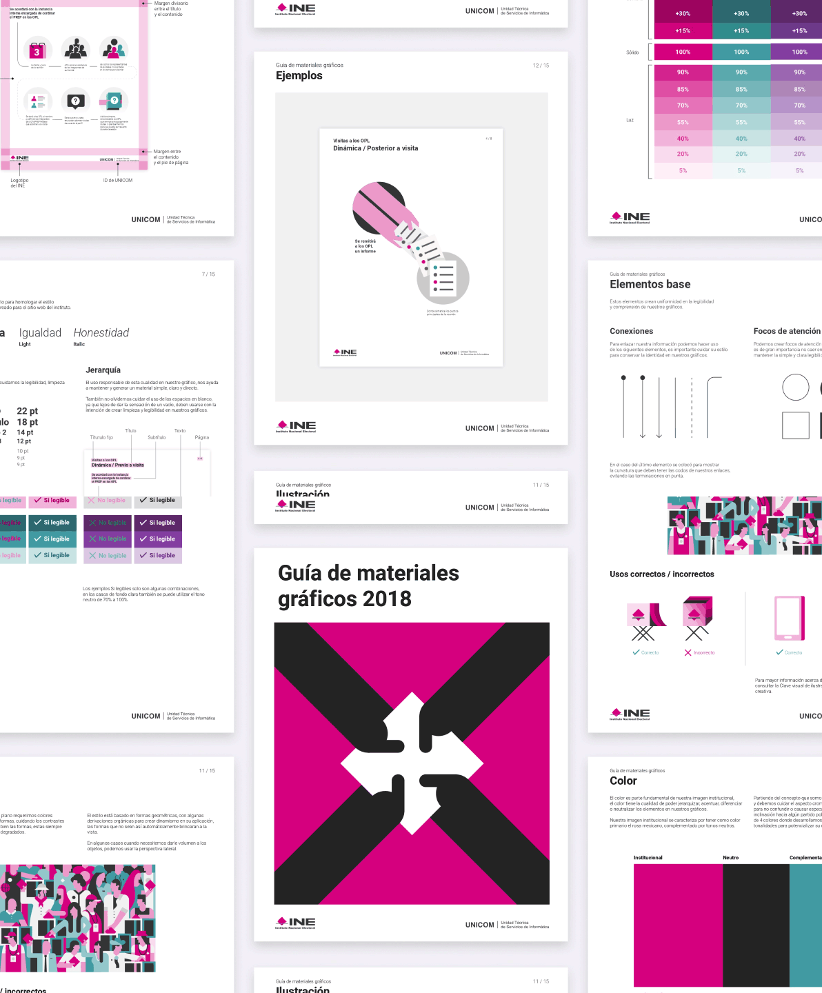
INE – PREP Help Materials. 2018.
Branding y sistema de ilustración para el centro de ayuda y los materiales de capacitación del PREP en las elecciones nacionales de México 2018, usado por más de 8,000 capturistas y 171,000 ciudadanos.
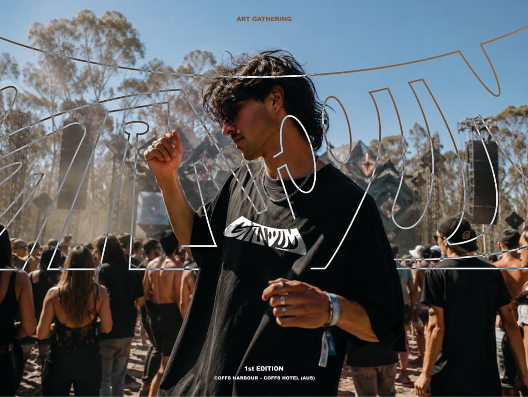
Gandum. Agosto, 2026.
Gandum es un festival que conecta la música electrónica y la cultura, la primera edición se realiza en Coffs Harbour, Australia en octubre del 2026.